Studio project — self-initiated. Not a commissioned client project.
Penedès Winery Identity
- Brand Identity & Strategy
- 2025
- Wordmark and mark, label system across 3 wine lines, colour and type system, 32-page brand guideline
- Fraunces, Work Sans
The brief we set ourselves: design an identity for a small, family-scale Penedès winery the way we’d want a real one to be treated — not a generic “wine country” aesthetic, but a mark and label system specific enough to survive contact with an actual bottling line.
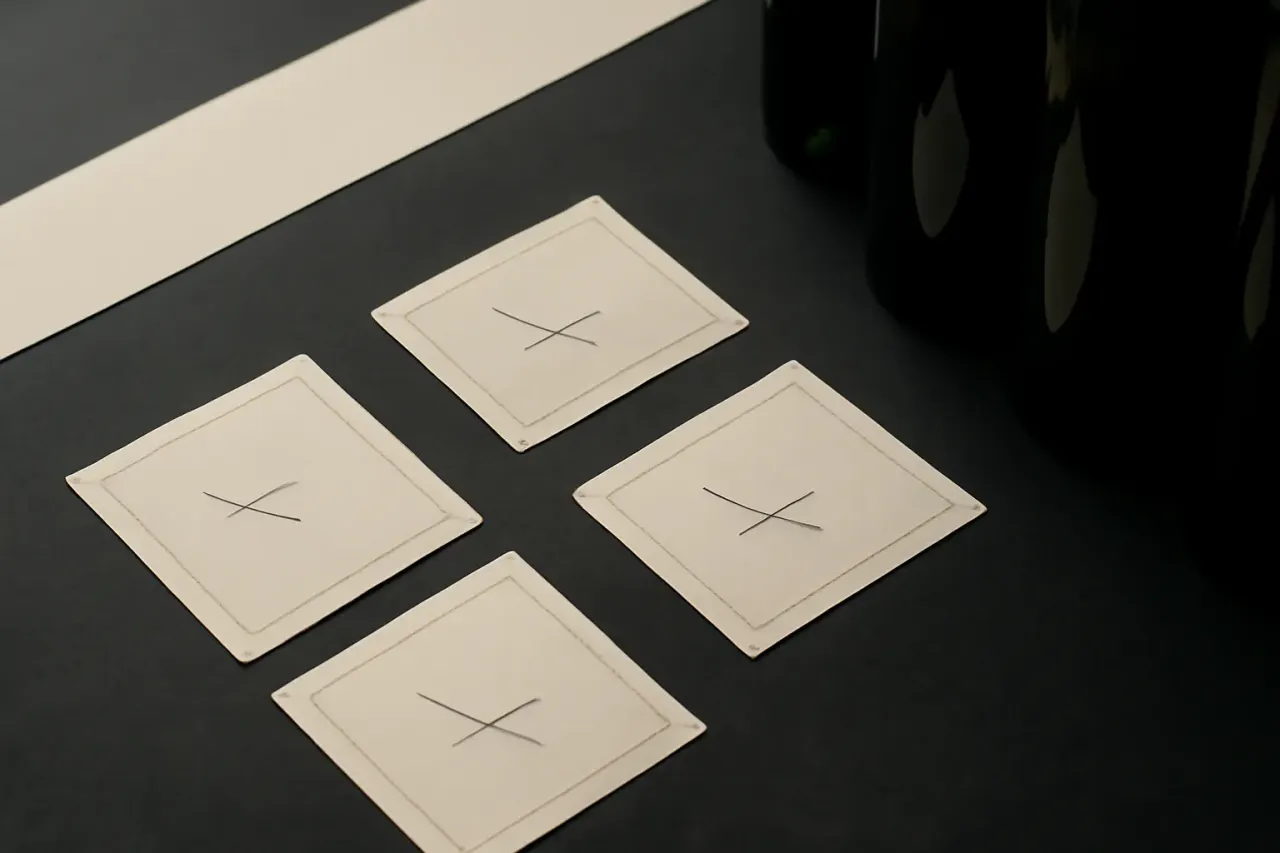
The mark had to work at three very different scales: a front label at arm’s length in a shop, a back label read up close on a table, and a favicon-sized version for a hypothetical online store. We built the type and colour system around a single registration-style motif so all three stayed recognisably the same brand.
The label system carries real production notes — bleed, registration marks, stock recommendations — the same discipline this studio applies to every Print & Editorial package. It’s exploratory work, not a commissioned result, so there’s no sales outcome to report — only the system itself, which is the point.
Know what this costs before you write a single email.
Every package on this site is priced, scoped and ready to add to your cart. If your project doesn’t fit a package, tell us about it instead.